Project Timeline: Between Jun 2016 - May 2018
The Brief
The client reached out to us with the idea of an app that enable users to get instant recommendations for food and entertainment locations nearby. The USP being that it will be able to inform the user how "trending" the place is at that point of time. This was a complex project with lots of challenges both in architecting the experience which thrives on "Right now" and making it visually appealing to our focus group. But the biggest task was to create a Habitual dependency in the early stages of the user journey.
Scribbles during our preliminary workshop
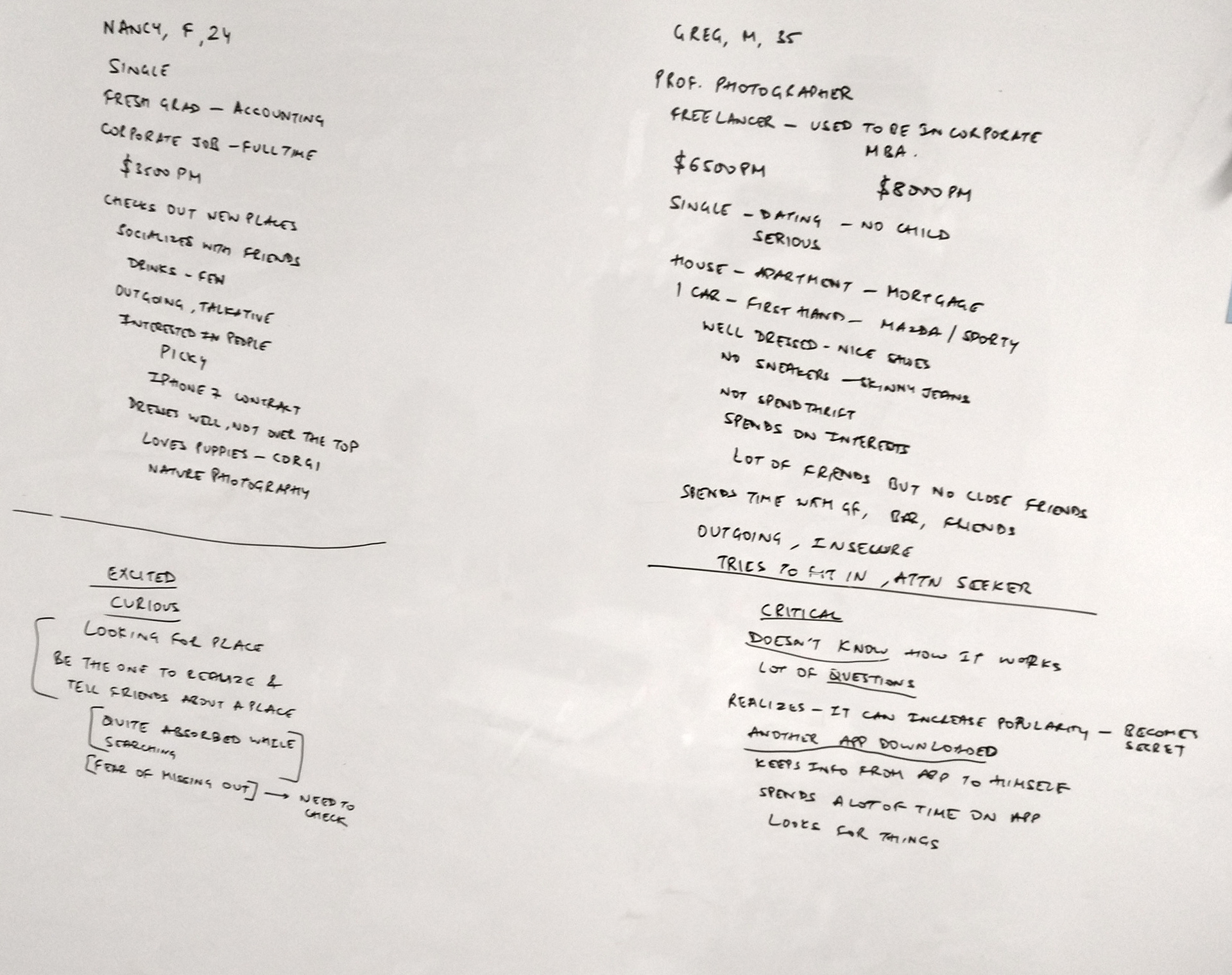
User research & Persona
While gathering the requirements, and understanding the business objectives, these 3 countries were shortlisted as ground zero for validating the idea.
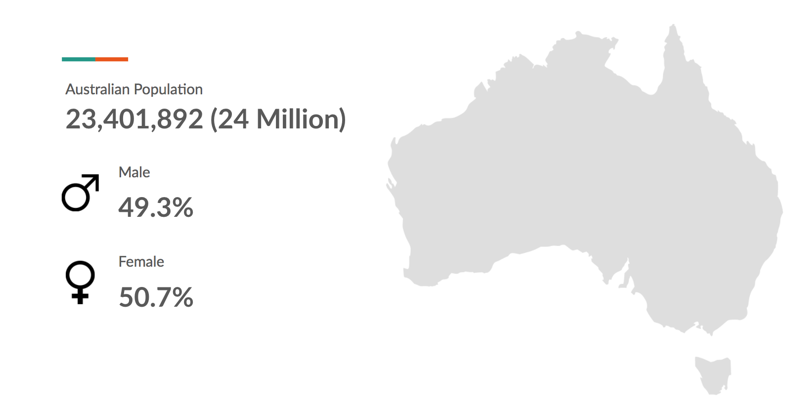
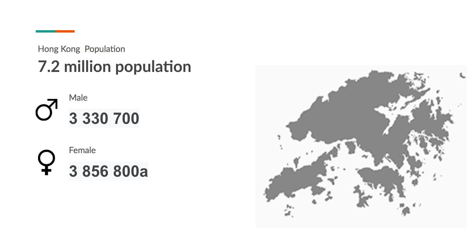
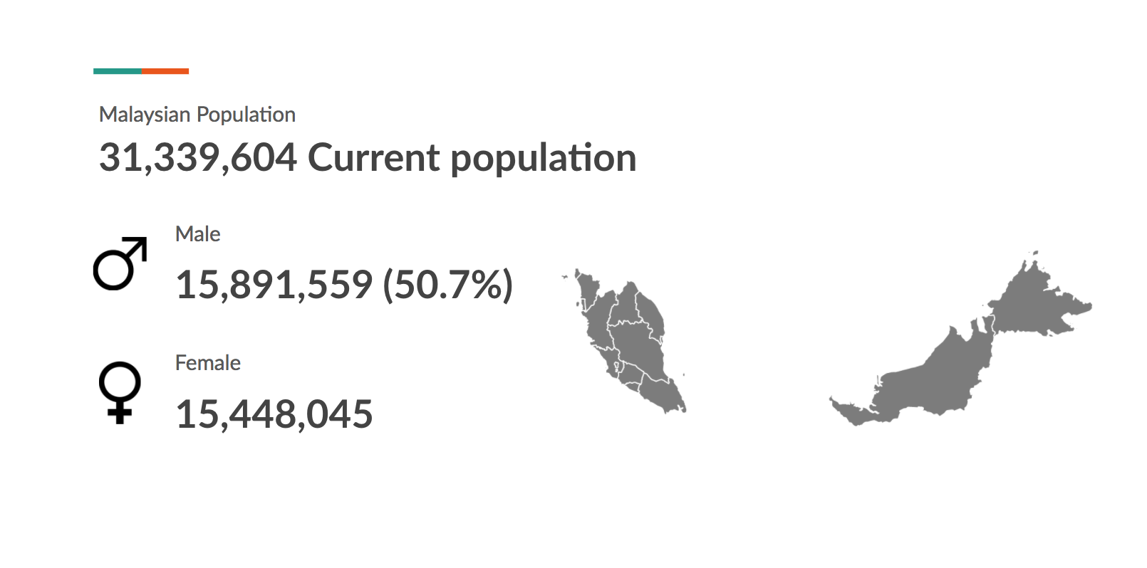
Australia Hong Kong Malaysia
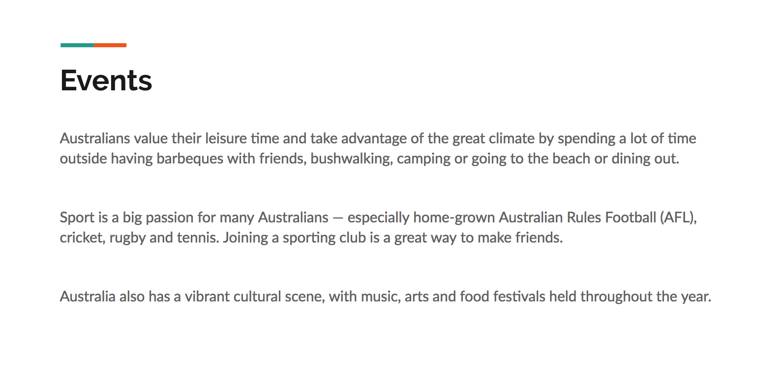
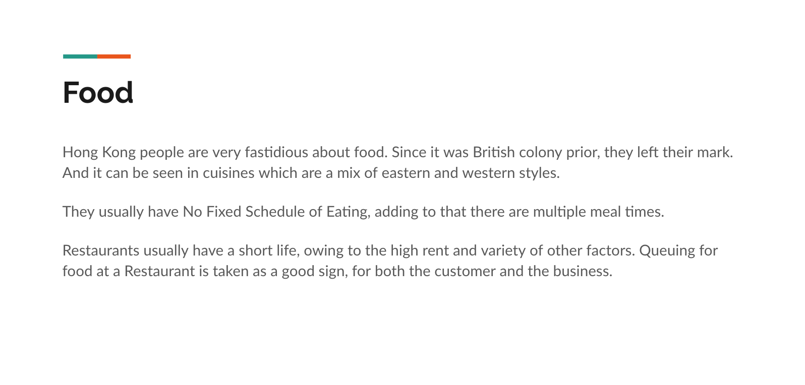
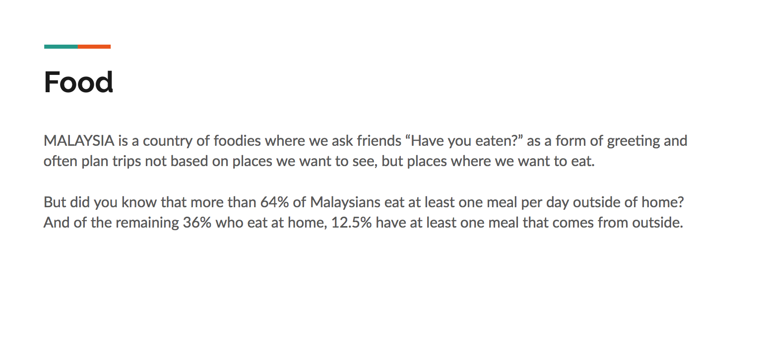
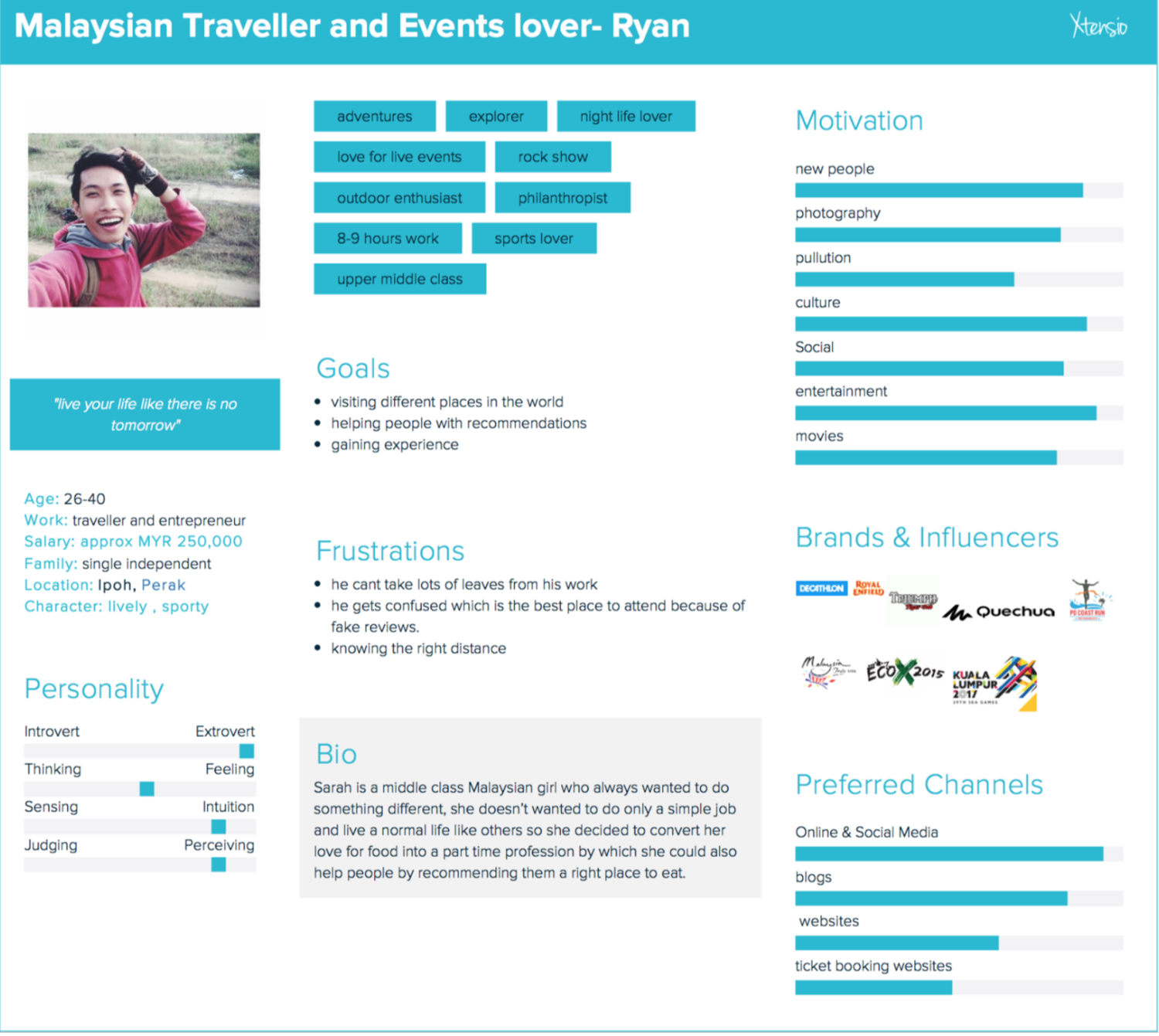
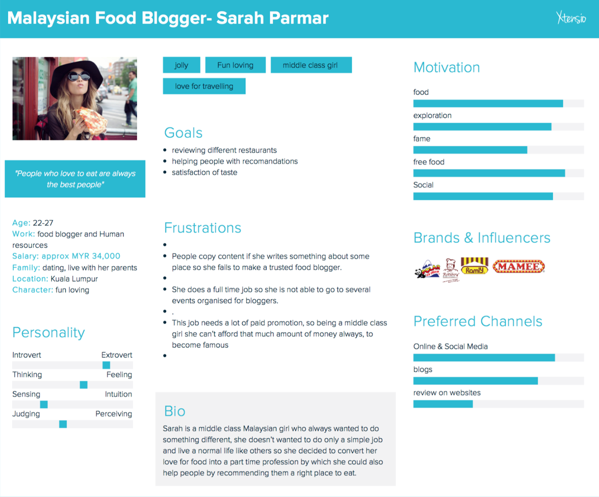
We started with quantitative research, competitive analysis, daily habits/routing of our user group regarding food, and analysis on "stereo-typical" behaviour regarding their meal patterns and dine-out vs take-out ratio. We also tried to analyse the factors that help people make these decisions (economical or cultural). The results helped us in capturing key insights about every location which further enabled us to create our Personas.
Australia Hong Kong Malaysia
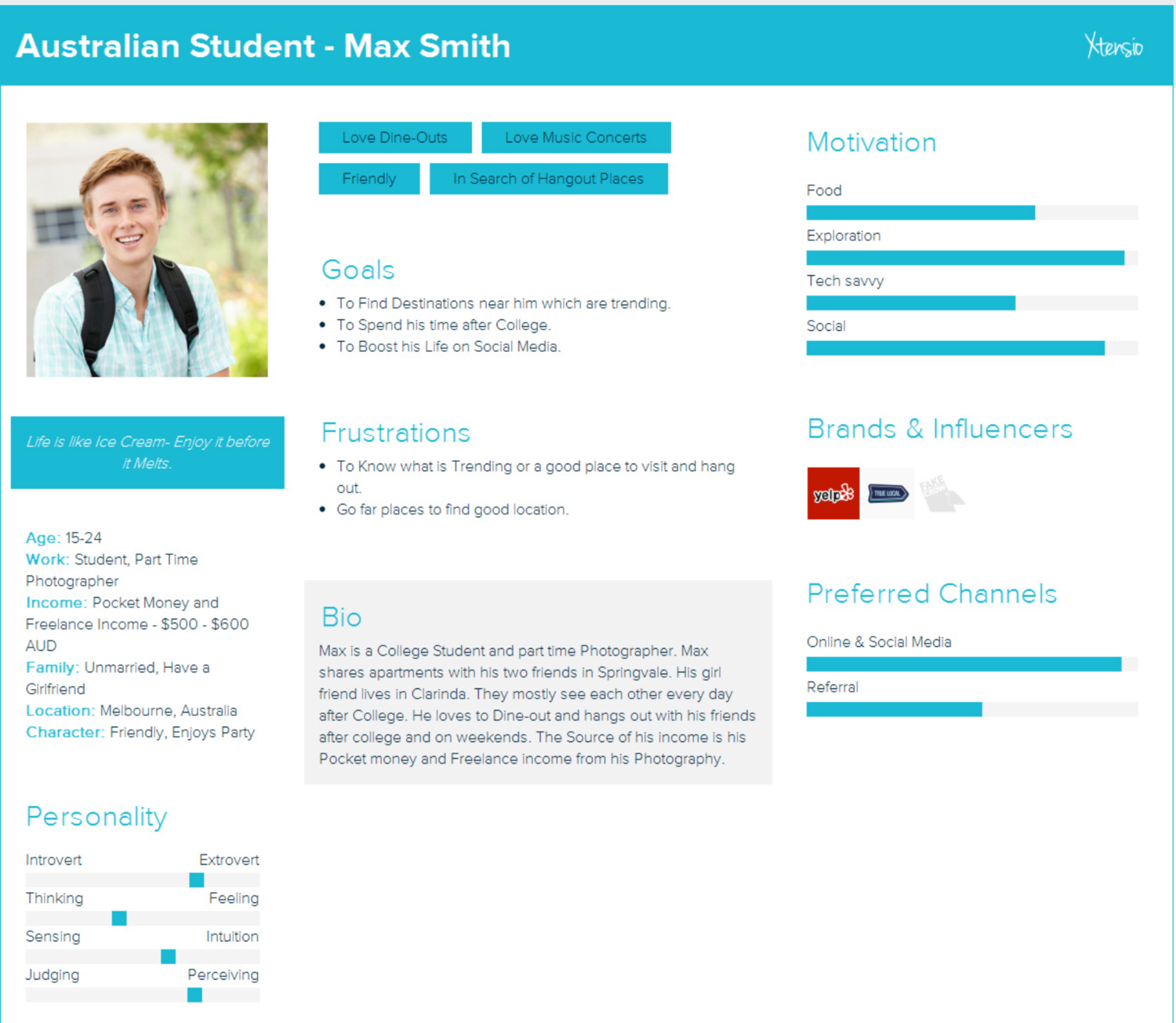
Personas
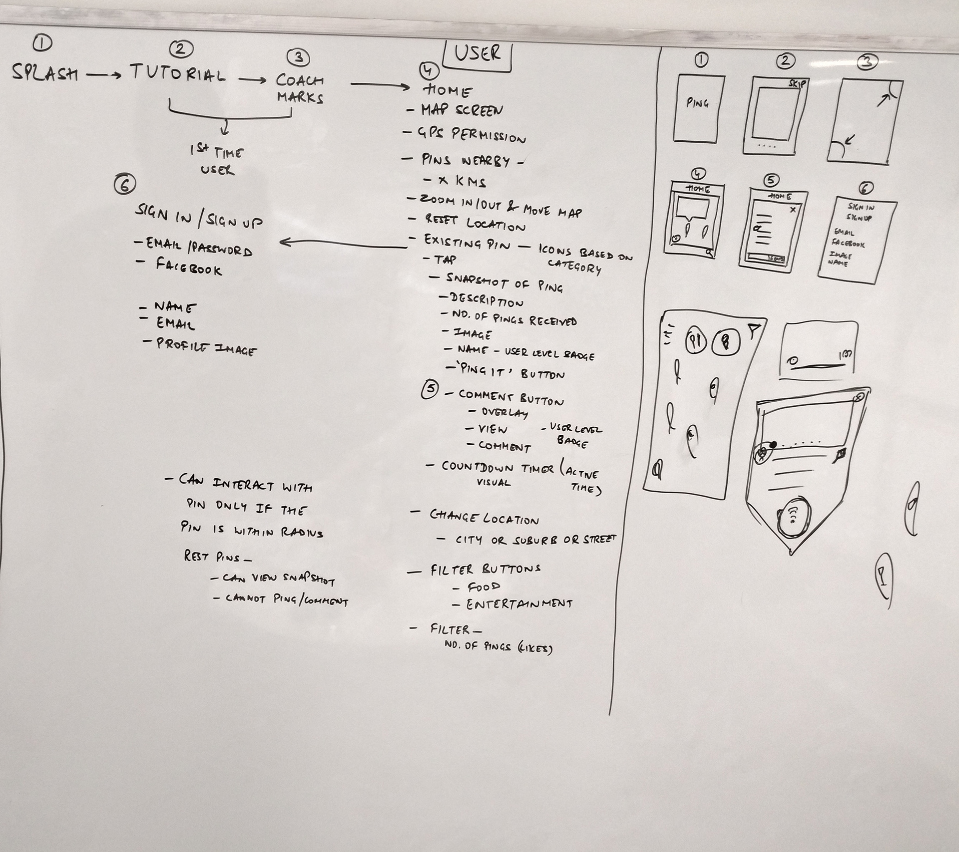
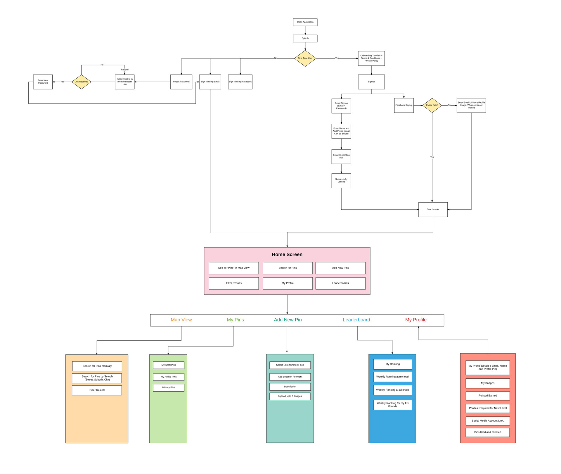
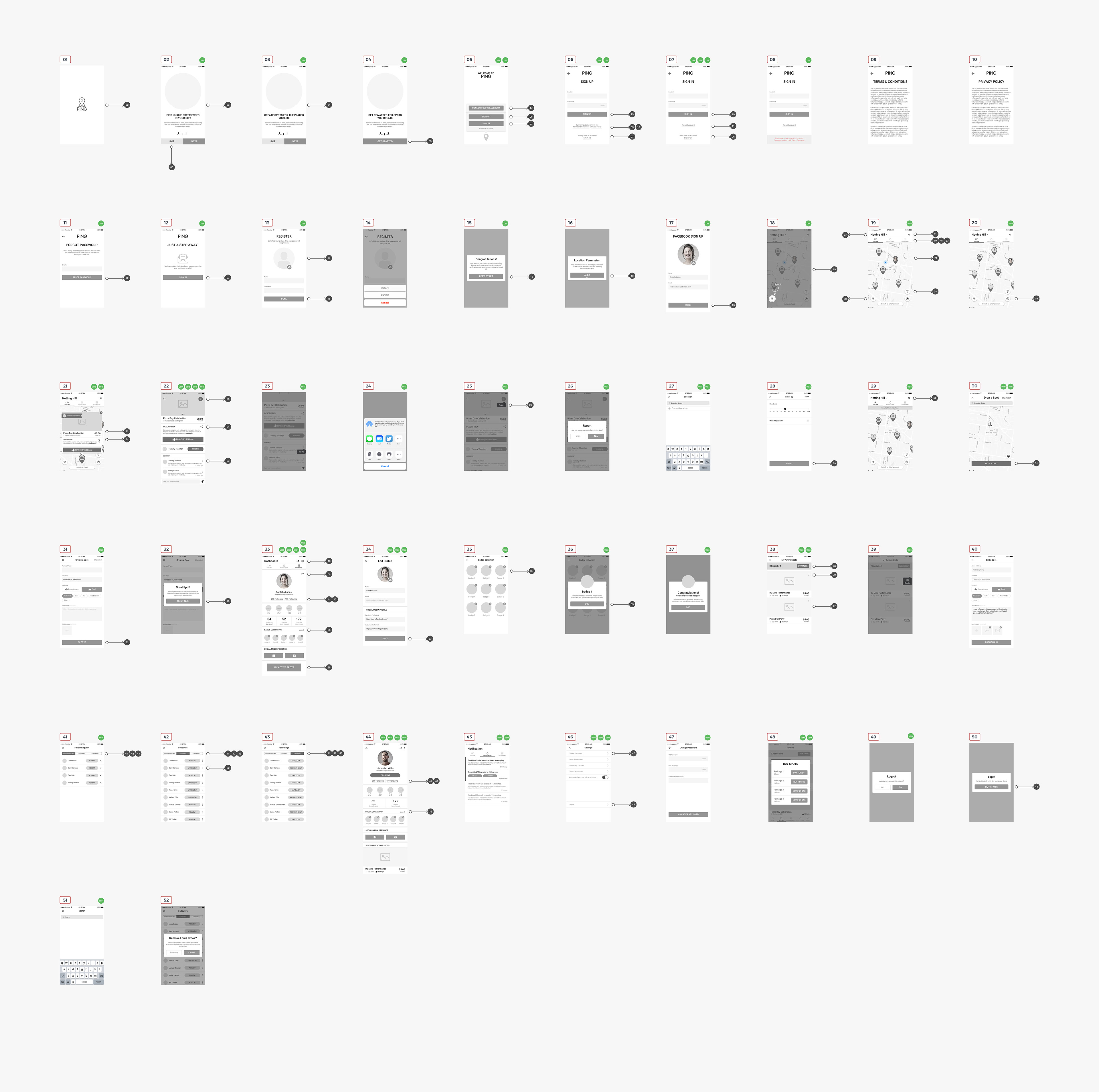
User flow and Wireframes
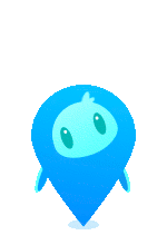
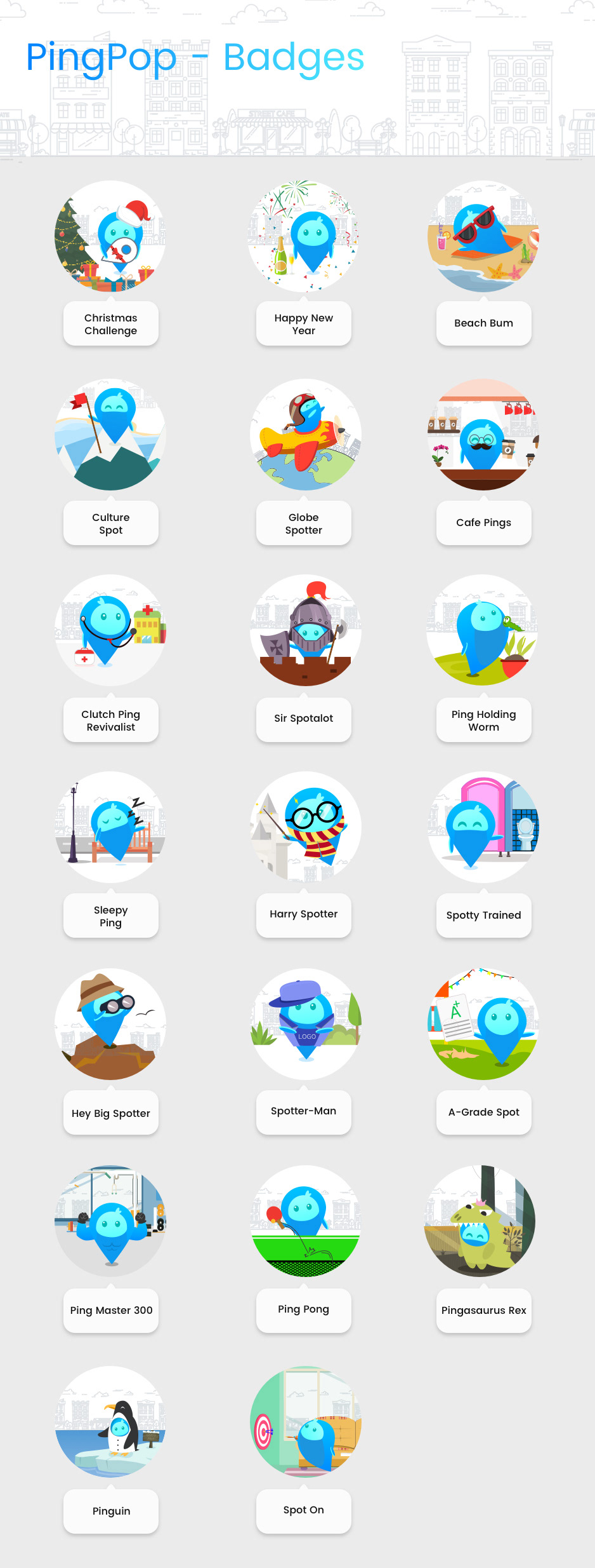
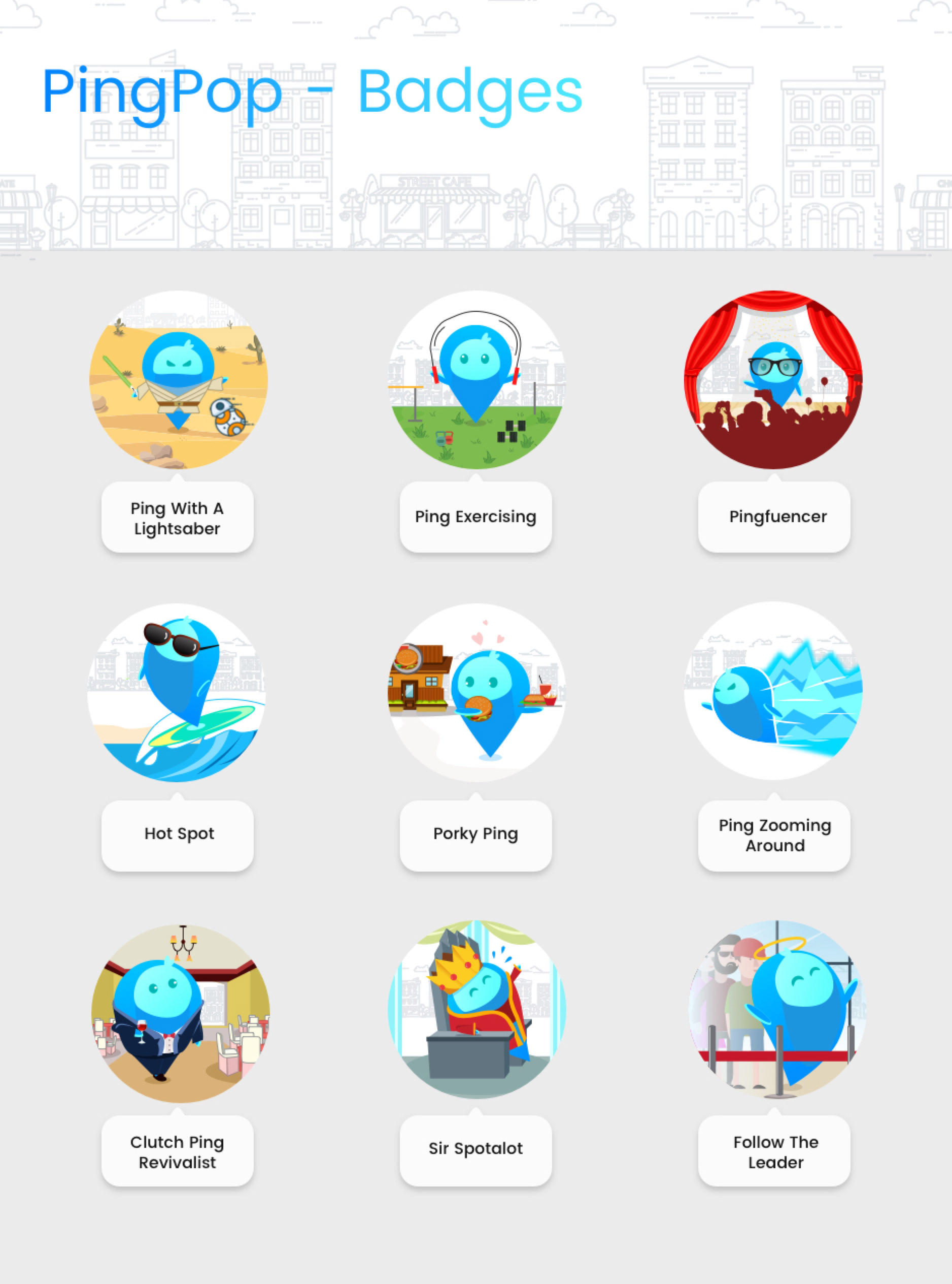
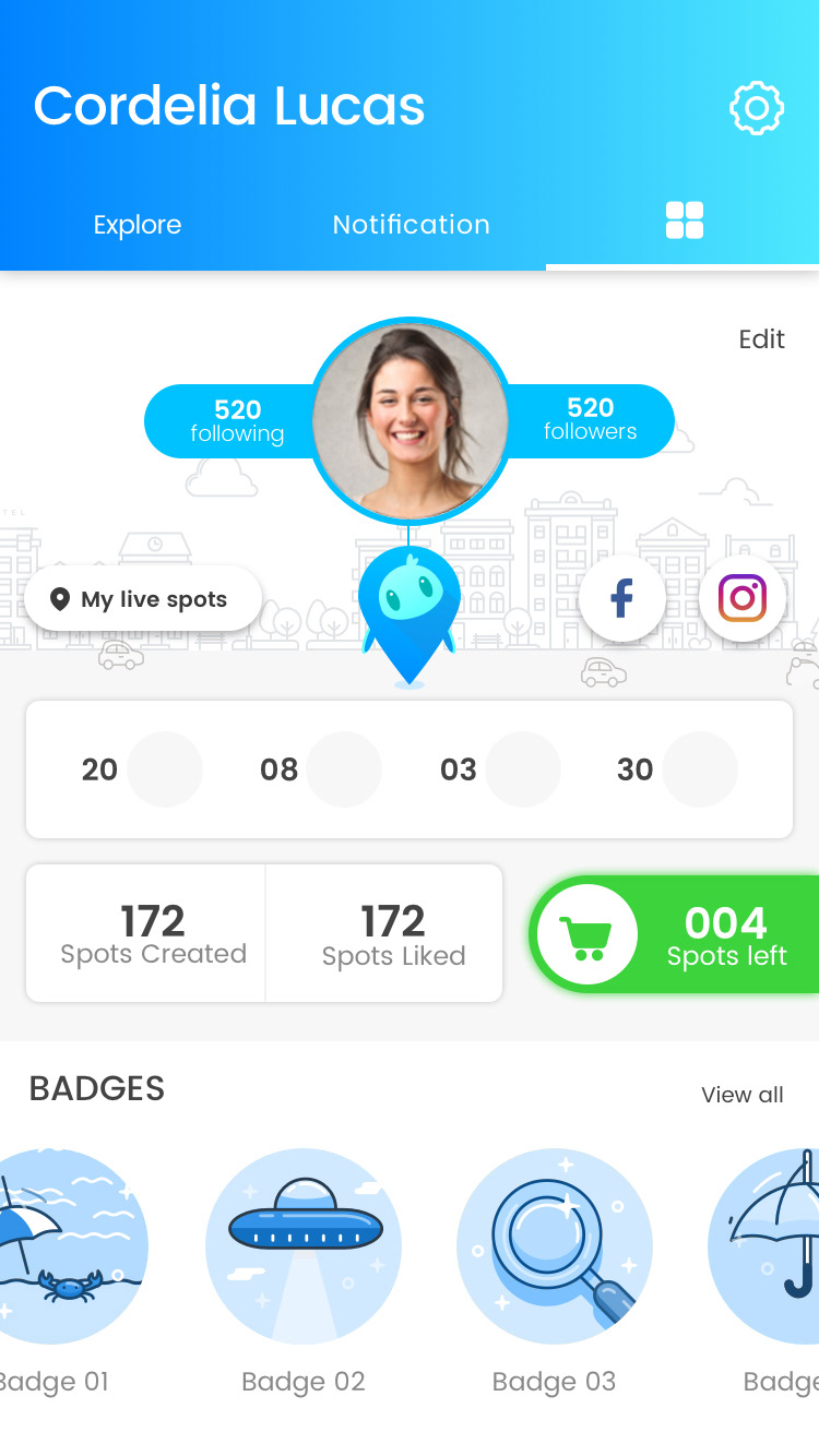
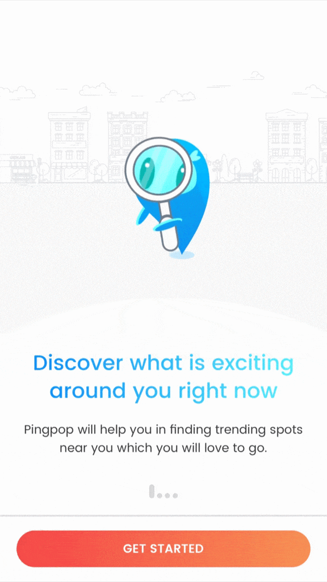
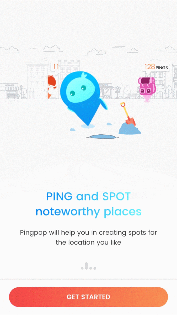
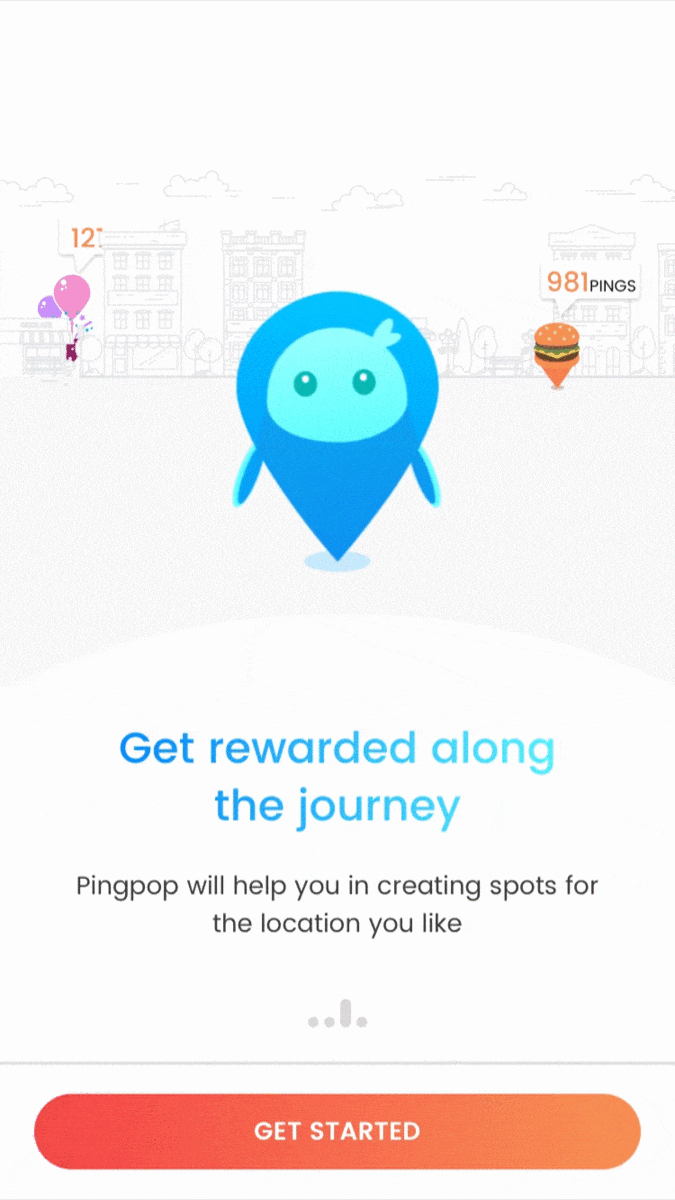
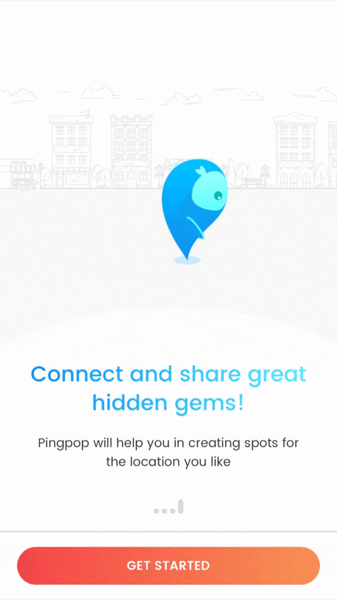
We started with user journeys, created flows for different scenarios. Onboarding was broken down in sequences, challenges were introduced to encourage the users to explore more of the app. Badges among other things were added as rewards. It was important that we factored "fun" as one of the most important derivative of the the experience.
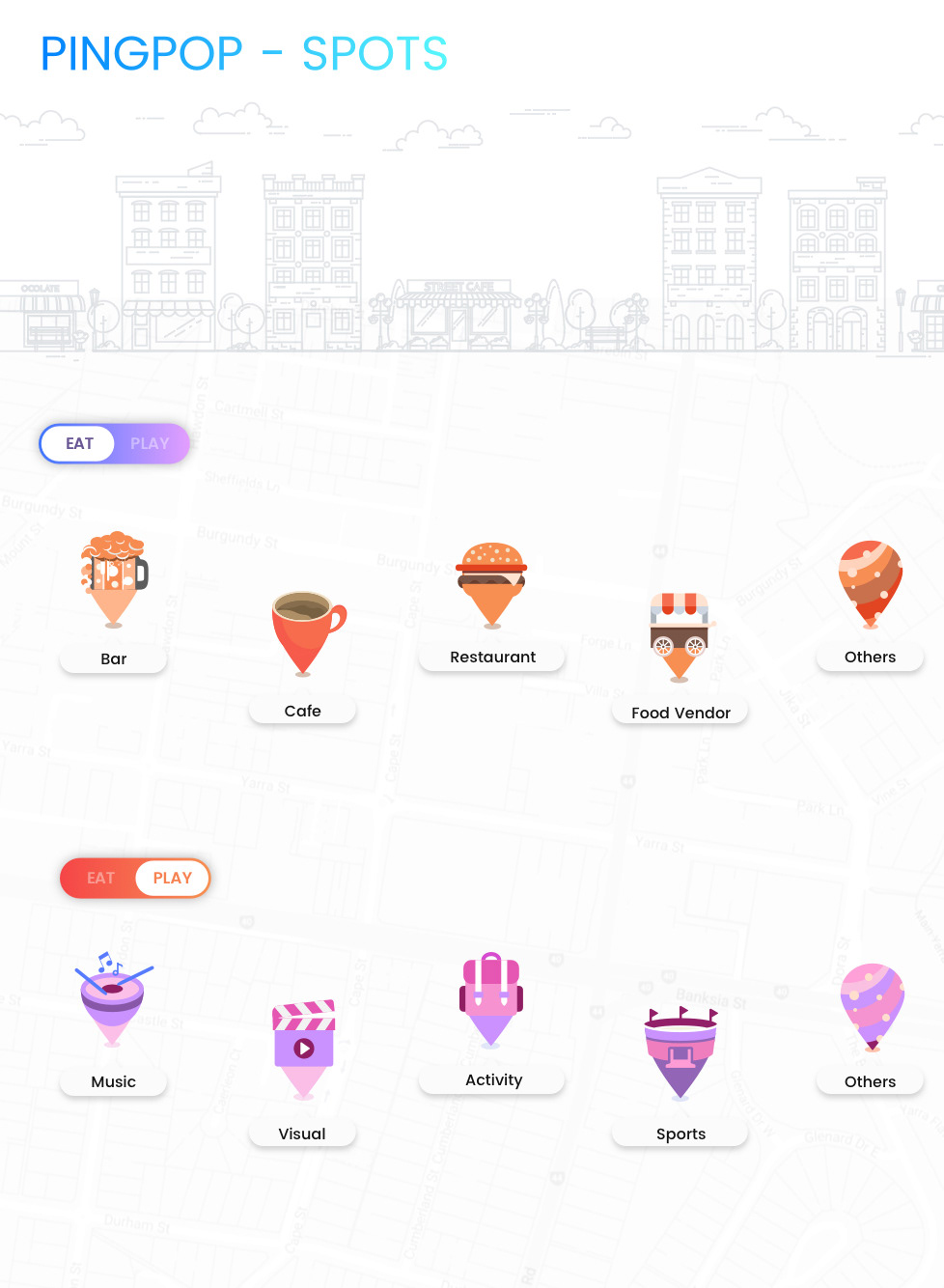
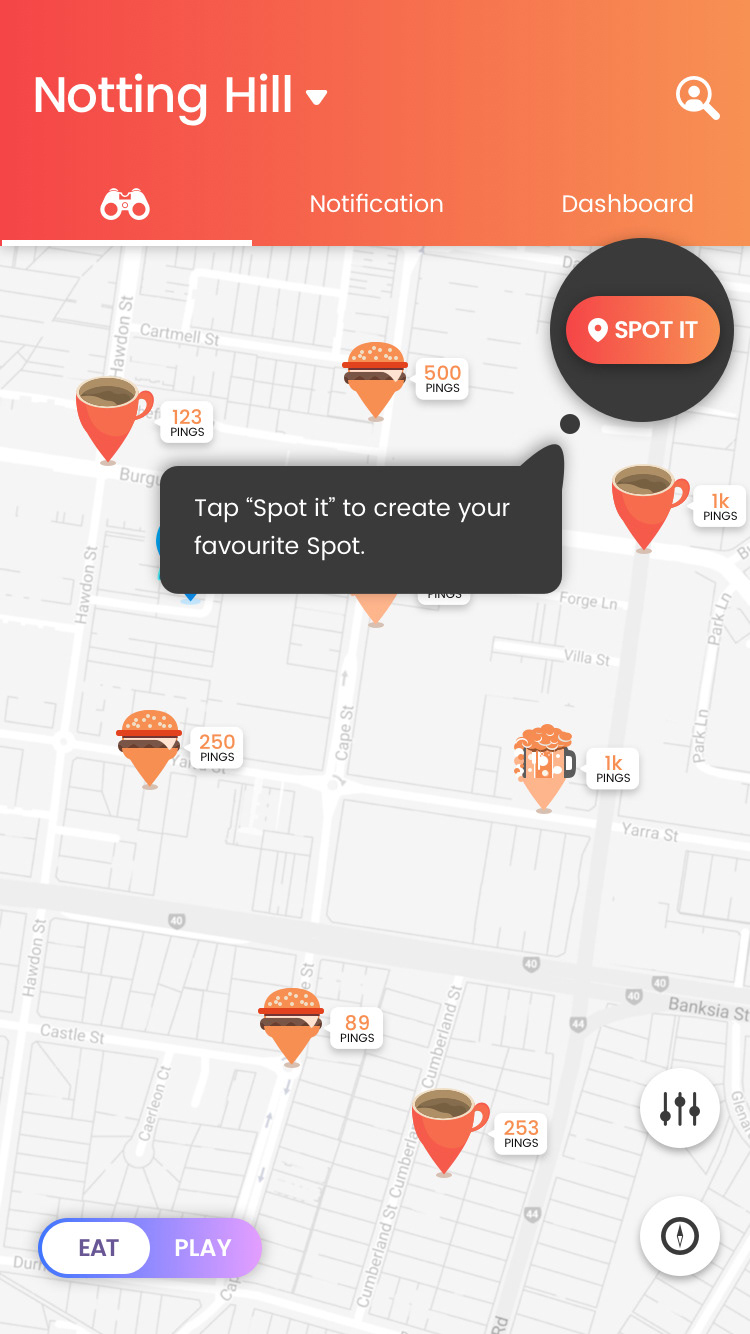
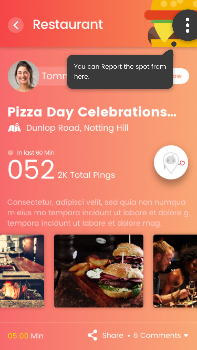
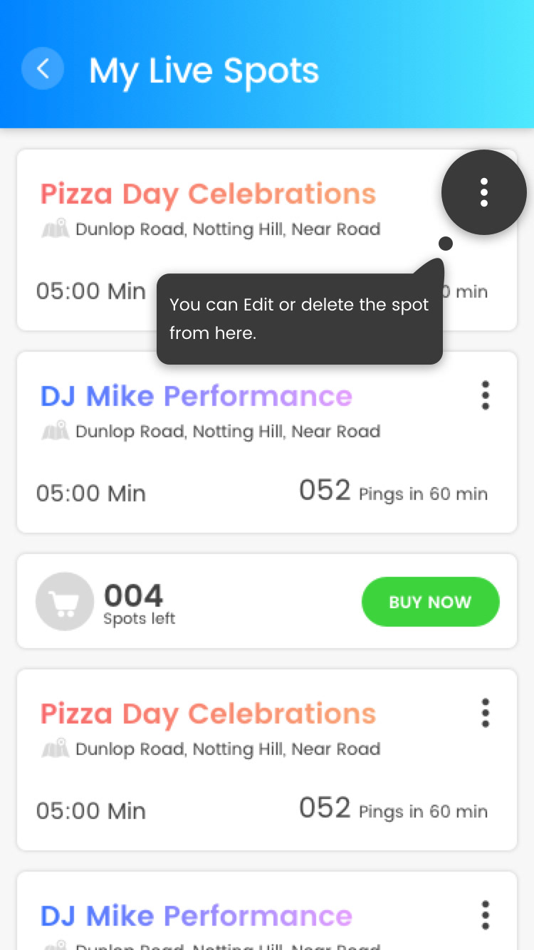
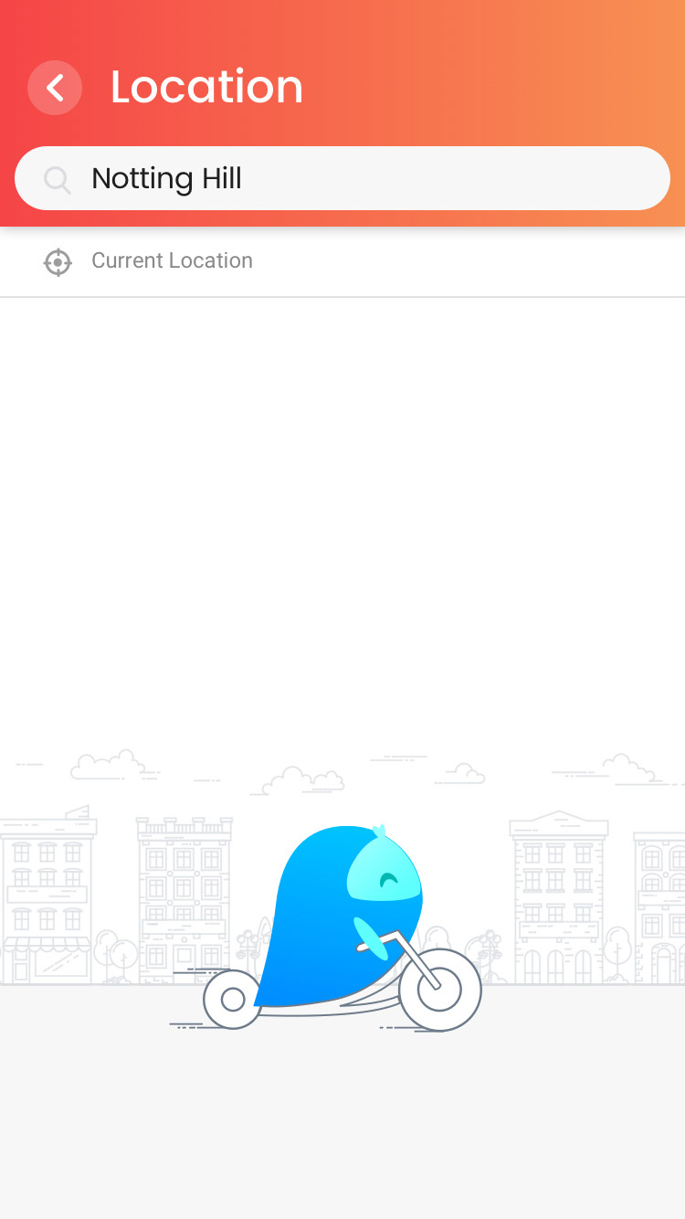
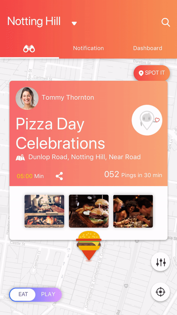
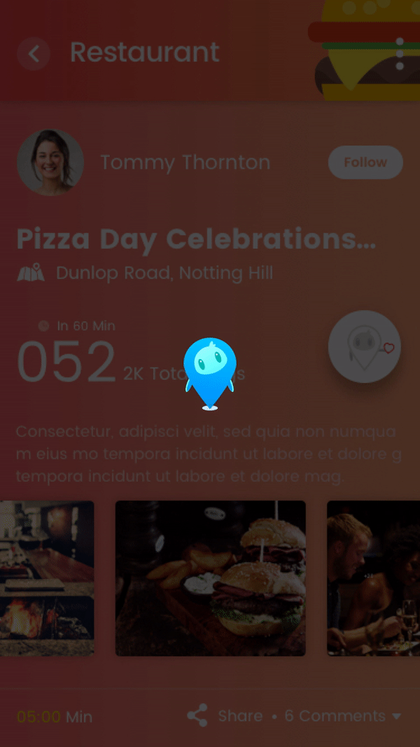
We achieved it by planning a lot of micro-interactions to surprise/delight at various stages of the user journey. And making a avatar/brand mascot to guide users interactively. We also established the lingo of the app. By changing two major categories name from Food and Events to Eat and Play, respectively.
Interface and Visuals
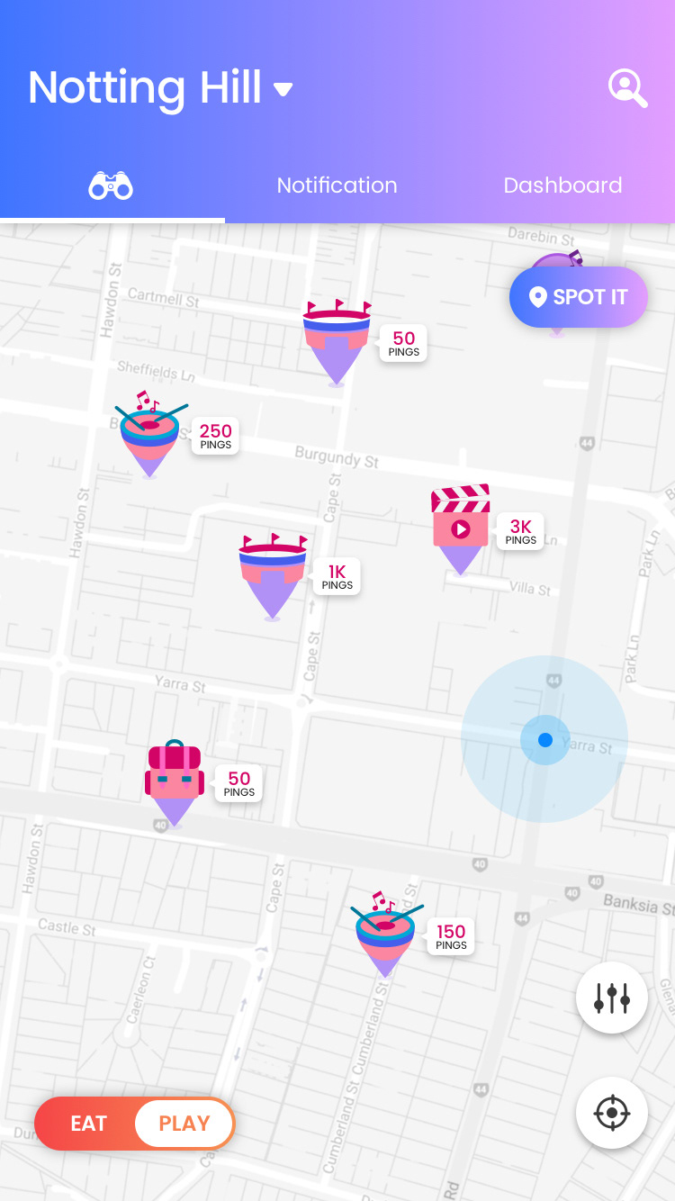
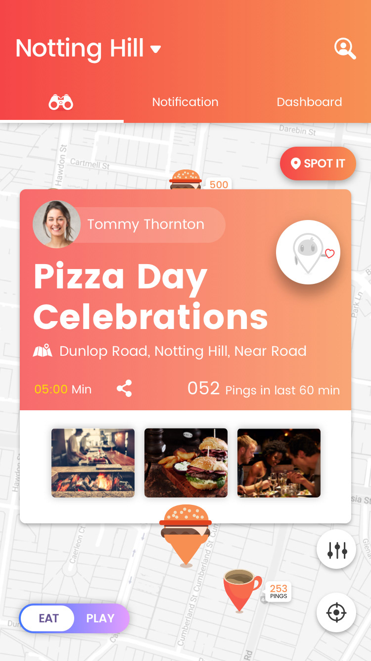
We chose 3 major hues to define the diversity of the app, with custom icons representing the categories. We chose Orange/tango hue to represent food/eat section and the purple/pink hue to represent night life/events/party/festivities.
They are perfect hues to bring out the specific mood we want the user to be in.
Which makes it more fun to play around the toggle button by tapping "Play" & "Eat".
Icons to be used in "EAT" and "PLAY" sections
Icons
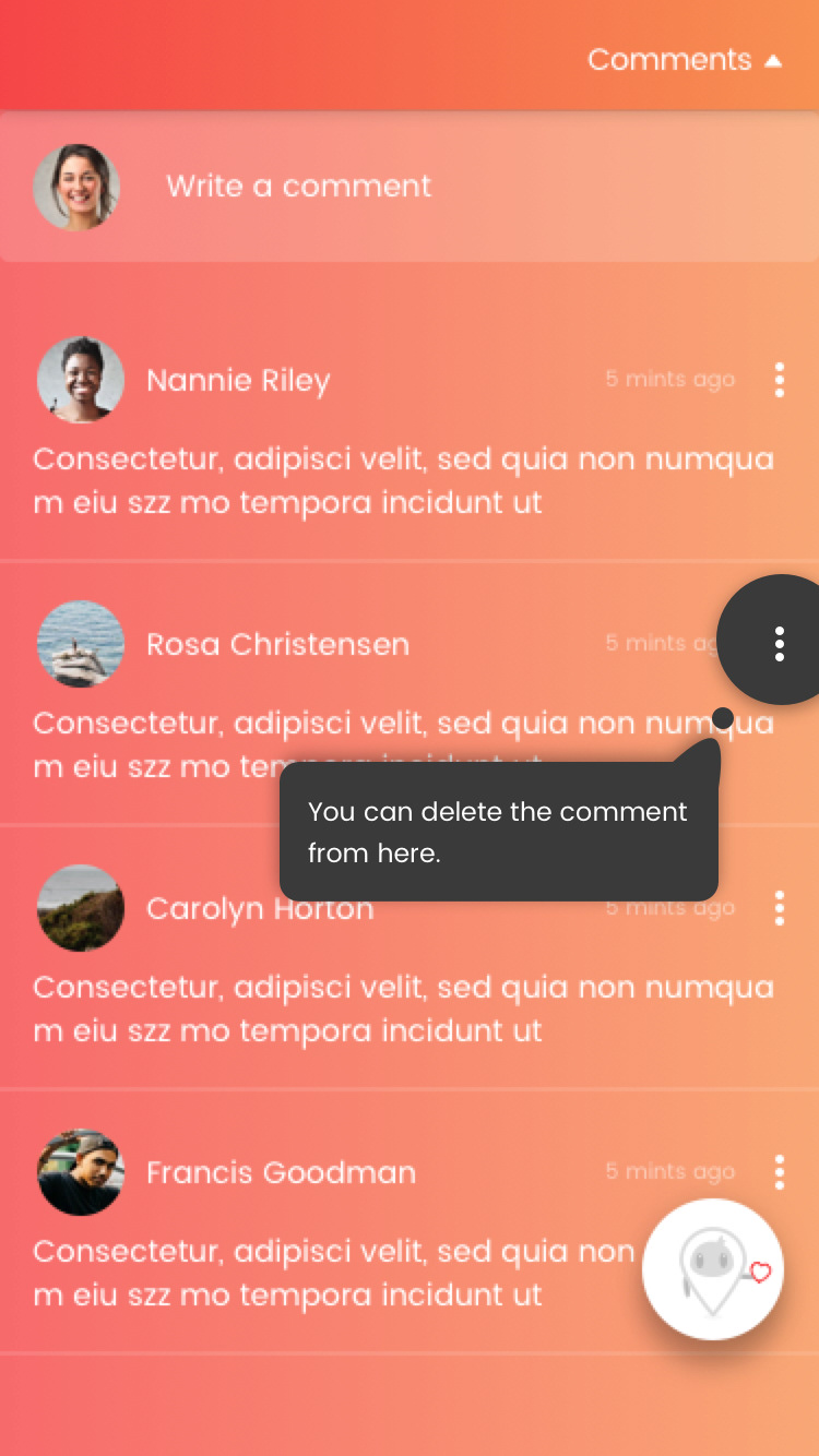
Interactions
Like Button Interaction . Loader
Onboarding Interaction
Conclusion
This was a long and tedious journey in which parameters changed constantly to make sure business objectives were aligned with user goals. But nevertheless had great fun working with a fantastic team.